Windesheim acquires a new ‘communication concept’
The university of applied sciences requires a new strategic branding direction. For the last couple of months lots of work has been put into a new ‘concept.’
Communication manager Jeroen Kramers: “It is about the story that Windesheim wants to envision. What defines Windesheim? What do you want to tell?” The old approach mainly focused on Windesheim as an institution of knowledge. The new approach focuses on Windesheim as a university of applied sciences that gives everybody who is suited a chance to follow higher professional education.
This new form of communication will reflect in new folders, posters, adverts, on the website and of course the open days. Because especially at the open days everything and everyone should tell the ‘story of Windesheim.’ Kramers: “Most important is how we tell this new story.”
The last couple of months students, employees and external professionals were interviewed and asked: what stands out when you are talking about Windesheim? This information was split into four ‘core values’ by the communication team: inspiring, active, personal and together. These four values form the base of the ‘story.’ The values also produced the slogan: ‘Closer to you.’ Following these events, three communication agencies were asked to make a new communication concept. They were also tasked with re-branching and dusting off the old Windesheim logo. In the end, one communication agency has been chosen – Dear – which will work together with the Windesheim team with regards to the task at hand.
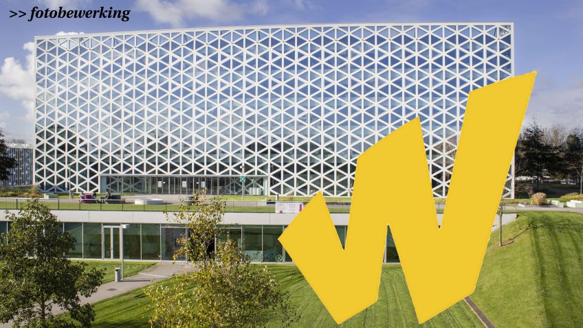
Kramers: “It sometimes occurs that the customer hires a communication firm for a lot of money. This firm then comes up with something beautiful which the customer has to use, this is not the case with this task. Instead, we work closely together with Dear and their concept.” The yellow “W” which is seen in the new logo will be the trademark of Windesheim. For example: it will be the first character you see on posters. However, there are feistier plans with regards to the ‘W.’ “We want to raise a giant ‘W’ somewhere on the Windesheim campus, something comparable to the ‘I Amsterdam’ which stood on the Museumplein, in Amsterdam (which has been removed a while ago – how stupid!) which can be used by students as a place to make photos.”
Furthermore, posters, folders and so on will be made in set colours. These materials should work to envision a certain form of recognisability. Kramers: “When you walk onto the campus, you know you are at the campus but it doesn’t feel that way. We want to develop a strong sense of ‘vibrant campus feelings’when you walk onto the campus – especially since education is becoming a lot more personalized. That is why we want to use the colours on the footbridges. This way everyone sees that this is Windesheim’s campus and that all the different divisions and study programmes are connected.”
During the next couple of months we will test all sorts of different demonstrations to gather input. We try to release the new style in phases. For the current recruitment cycle for new students we will use the concept which is currently in place. The new concept will start showing near the summer. With the start of the new academic year the entire process should be completed. (MH)